Earlier today at the Future of Web Apps conference in Dublin, Robin Christopherson from UK charity AbilityNet gave a talk on website accessibility. I’ve seen quite a few different talks and sessions on website accessibility and understand how important this topic is. This talk however really hit home – Robin is blind and gave the whole presentation & demonstration while using a screen reader.
I understand how screen readers work and have tried out some myself, but seeing someone use one in a real situation was really humbling. I can’t even begin to imagine how difficult it is to use a large part of the internet for someone who suffers from a disability that affects their ability to use a computer.
Robin showed off number of web apps that worked well with screen readers such as FixMyStreet.com, a service that allows you to report problems to your local council. Another site that worked well was Google Maps (in particular the ability to get directions to a specific location).
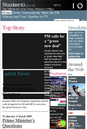
What really surprised me however was how poor the accessibility was on new Downing Street website. When the size of the text on the site is scaled up, the design just breaks completely. For a public service website, this is quite disturbing, and really needs to be addressed ASAP by their web team.
I wonder how many other Government / public service sites do not consider these issues?